Editor Guide
This guide is for content editors using a Hydra-powered site. It covers how to use the editor — how to select things, edit text, add and move blocks, work with containers and templates — without assuming you know how the site was built.
Hydra mechanics vs your site's design system
Two layers are stacked on the editor screen:
- Hydra's mechanics — the toolbar, sidebar, selection borders, Quanta toolbar, slash menu, link picker, image picker, container operations. These look and behave the same on every Hydra-powered site, and this guide covers them.
- Your site's design system — what block types exist, how they render, which fields are inline-editable, the names you see in menus. The live preview comes straight from your frontend, so a "paragraph" might be called "Lead paragraph", an image block might have a caption your developers added, the slash-menu list of available block types reflects what your site registered. The mechanics are the same; only the labels and visuals change.
If something in this guide doesn't match what you see, it's almost always because your design system named or styled it differently — the underlying interaction is still the same.
What you see
The editor screen has three regions:
- Toolbar (left) — saving, navigating to other pages, site settings. Standard Volto, plus the Frontend switcher (see below).
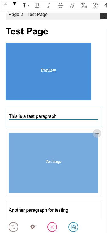
- Live preview (centre) — your actual frontend, running inside an iframe. This is what readers will see. Click directly into the preview to edit.
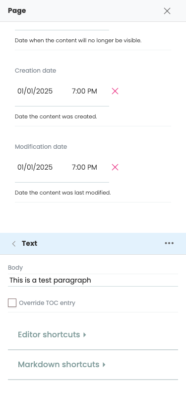
- Sidebar (right) — when no block is selected, lists the page-level fields (title, description, blocks). When a block is selected, shows that block's settings, the chain of parent containers, and (for container blocks) the list of children. See Selecting blocks for the navigation patterns.
Frontend switcher
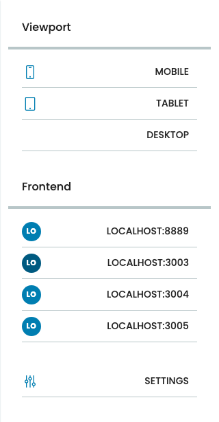
A toolbar button opens the Frontend switcher panel with two sections:
- Viewport — preview the page at common screen sizes (desktop, tablet, mobile). Pure visual switch — no content change.
- Frontend — list of saved frontend URLs the editor can switch between. Picking one swaps the iframe to that frontend immediately. Same content, different rendering — a Hydra-defining feature: edit a page once, see it on the marketing site, the docs site, the mobile app's web version, and the email-renderer in turn without leaving the page.
A Settings button at the bottom of the panel manages the saved URLs (add, remove, rename). The currently active frontend is highlighted in the list.
Two ways to edit any field
Most fields can be edited from either side:
- From the preview — click the rendered text/image/link directly and start typing or replacing media.
- From the sidebar — find the field in the block's settings panel and edit it there.
Sidebar editing is always available. Inline editing depends on the frontend supporting it for that field; some fields show a thin underline when hovered to signal they're inline-editable. Either way the result is the same — there's only one source of truth.
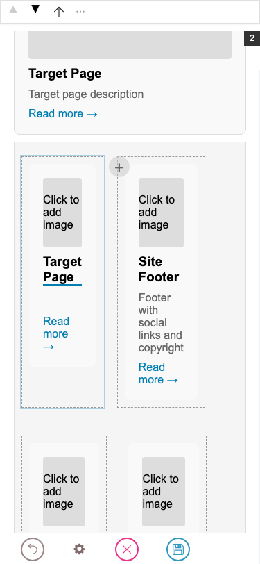
What's a block?
A block is a discrete piece of page content with a type (slate, image, listing, slider, etc.), a schema (its fields), and a position. Blocks can be added, removed, moved, and configured. Some blocks contain other blocks — those are called container blocks (columns, accordion, slider, grids, sections).
The page itself is a list of blocks (sometimes split across multiple regions like header / content / footer). When you click into the preview, you're clicking on a block.
When in doubt — Escape
Pressing Escape is always safe. It progressively backs out:
- If you're typing in a text field → leaves text editing, the block stays selected.
- If a block is selected (block mode) → goes up to the parent container.
- If nothing is selected → no-op.
So Escape repeatedly takes you up one level at a time. See Selecting blocks for what selection looks like at each level.
Editing on a phone
On narrow screens (≤767 px) the editor reshapes into a two-bar layout: the Quanta toolbar pins to the top of the viewport — always visible, never fades — and the main toolbar (Save, Cancel, Frontend switcher, Settings shortcut) sits as a compact bar at the bottom. The iframe canvas fills the space in between. There is no side panel: the sidebar opens as a full-screen sheet, popups slide up from the bottom, and the link editor takes over the top bar.
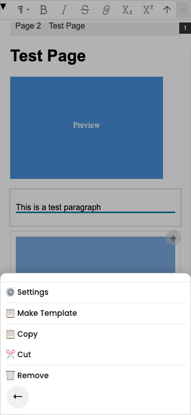
Bottom-sheet popups
The ⋯ menu — and every other contextual chooser (block-type picker, frontend switcher, convert chooser) — slides up from the bottom of the screen with the canvas dimmed behind. Tap the back arrow at the bottom-left of the sheet to dismiss; the canvas underneath comes back unchanged.
Sidebar as a full-screen sheet
A side panel is impossible on a 375 px screen. Instead, opening the sidebar (via the Settings shortcut in the main toolbar, or by choosing Settings in the ⋯ menu) covers the entire viewport. The X button in the top-right closes it and brings you back to the canvas. While the sidebar is open, the iframe is hidden behind it — same source of truth, just a different surface.
Escaping nested blocks with ⬆
Phones don't have an Escape key. To walk back up out of a nested block (a teaser inside a grid, a paragraph inside a column), the Quanta toolbar shows an extra `⬆` button to the left of ⋯ whenever the selected block has a parent. One tap selects the parent container; tap again to keep walking up.
Differences from desktop in one place
Desktop / tablet | Mobile (≤767 px) |
|---|---|
Quanta floats near the block, can fade after idle | Quanta pinned to top, always visible |
Main toolbar on the left, full height | Main toolbar at the bottom, 44 px compact |
Sidebar on the right as a side panel | Sidebar covers the whole screen |
|
|
| Tap the |
Otherwise everything works the same: tapping a block selects it, tapping into text starts editing, the same fields and the same blocks. The mechanics are unchanged — only the placement and gestures differ.